
Byron, Lisa, and Emmitt (from The Garden of Delights), 1998/2016
archival pigment prints
triptych: 61 x 24 x 1-3/4 inches, each panel (framed), 155 x 61 x 4.5 cm; overall: 61 x 76 x 1-3/4 inches, 155 x 193 x 4.5 cm,
edition of 3 with 2 AP
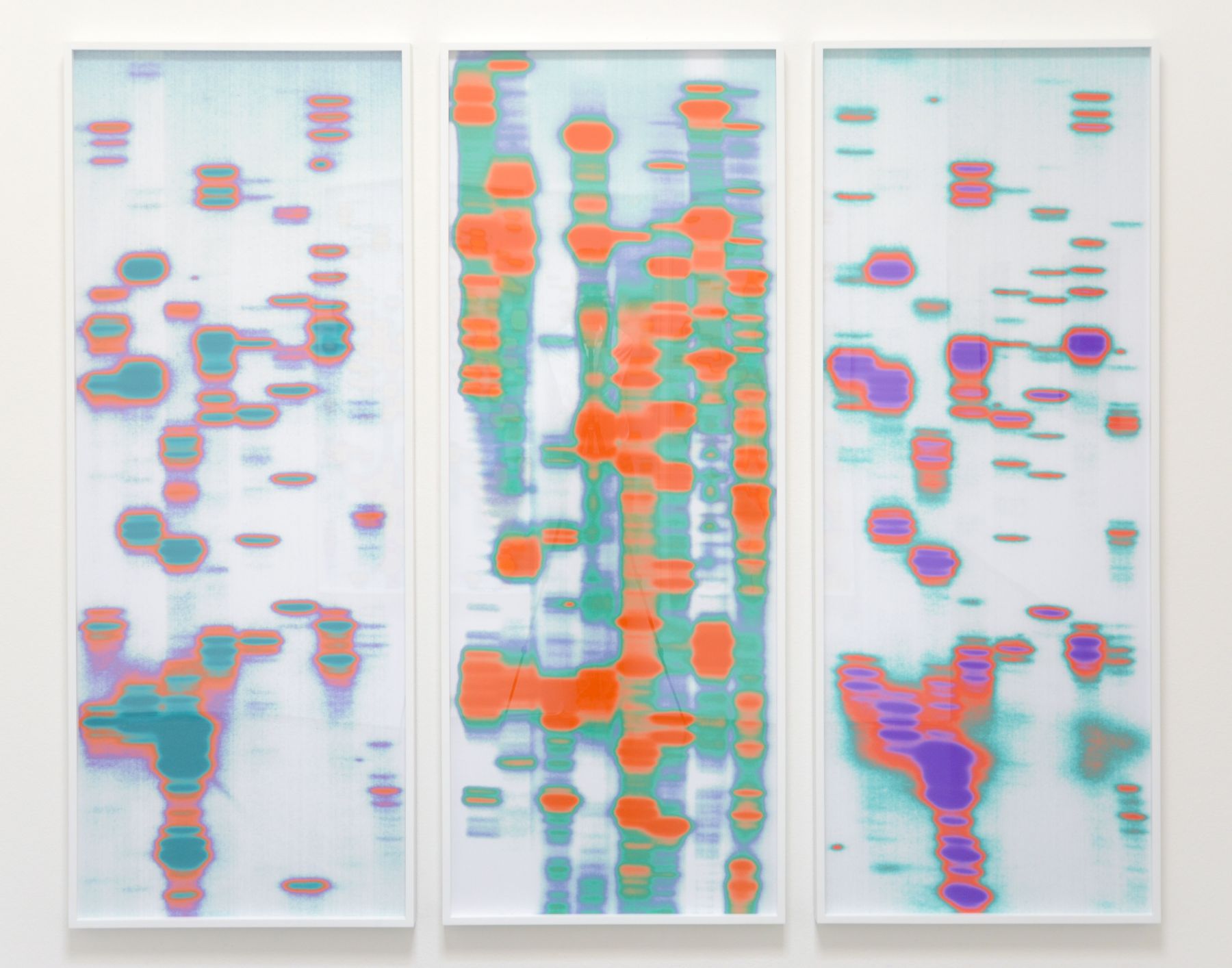
Infrared reference. Color inversions. Color-rendering with digital technology is always precarious in terms of perception and accuracy/authenticity. Given that these colors seem arbitrarily assigned to the process, it may not matter what result. Then again, it’s hard to imagine otherwise, a lack of intent that is. And if these works lack concern for color authenticity why go to such lengths to assign them? Meaning, if these works are more about the ideas, they could easily exist in grayscale or any color combination whatsoever. So, what do these triad of colors do in each triptych?

Lu, Jack and Carrie (from The Garden of Delights), 1998/2017
archival pigment prints
triptych: 60-1/2 x 23-1/2 x 1-3/4 inches, each panel (framed), 153.7 x 59.7 x 4.5 cm; overall: 60-1/2 x 74-1/2 x 1-3/4 inches, 153.7 x 189.2 x 4.5 cm,
edition of 3, with 2 AP

Jin, Calvin and Lisa (from The Garden of Delights), 1998/2017
archival pigment prints
triptych: 60-1/2 x 23-1/2 x 1-3/4 inches, each panel (framed), 153.7 x 59.7 x 4.5 cm; overall: 60-1/2 x 74-1/2 x 1-3/4 inches, 153.7 x 189.2 x 4.5 cm
edition of 3, with 2 AP
Triptych. I think often about DNA fingerprinting from my AP Bio class in high school. That has always stuck with me as a process and a form. So, it is with such enthusiasm that I view these works here, three triptychs, three different color schemes. Each migrated left to right color wise. Transmigration. The triptych is a loaded form art-historically speaking. The trinity. Here, vertical sections overlap in a watery light on water kind of way or possibly even Matrix-type scrolling. Organized like language but left open by lack of any recognizable symbols or other characters. They refer to people by each title, to Hieronymus Bosch, and to a lack of people ultimately. Color codes represent human identity.
Generative works that conceal identity visually yet reduce each being to its genetic code. We are just sequences and connections, configurations by virtue of creation, reproduction, multiplication and division. Threes and fours abound.
They also somehow recall for me a kind of Mark Bradford. Whereas, Bradford was grinding layers to reveal accumulated history, a palpable material history, these seem to be doing the opposite, the reverse.
No comments:
Post a Comment