


Broadsheet featuring Anne Truitt in the News American, 1975, #2, 2017
silkscreen and pigment on coated aluminum foil
22.25 x 14.375 inches.


Broadsheet featuring Anne Truitt in the News American, 1975, #3, 2017
silkscreen and pigment on coated aluminum foil
23.25 x 14.5 inches.


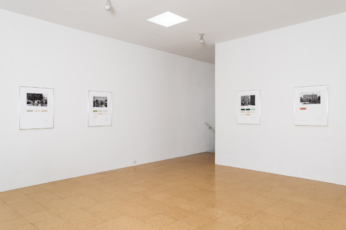
Color Census, 6211 Warner Drive, Los Angeles, 2016-2017
digital print on photo paper, painted color samples
29.5 x 22.25 inches (framed).


Color Census, 6112 Warner Drive, Los Angeles, 2016-2017
digital print on photo paper, painted color samples
29.5 x 22.25 inches (framed).


Color Census, 6247 Warner Drive, Los Angeles, 2016-2017
digital print on photo paper, painted color samples
29.5 x 22.25 inches (framed).


Here is a good example of how a grouping of artworks confuses the desire for simplicity in media nomenclature. They are works on paper, yet reading the press release, it seems like much more than that, a socio-architectural investigation that results in prints, but somehow they seem like residue or insufficient evidence (souvenirs) of where the art really happened, which was in the exchange, the boundary challenging experience between artist and homeowner at a threshold of domesticity, literally, a doorway between public and private worlds. Therefore, the transgression of interior/exterior spaces was met with mixed results, as might be expected.
And this issue with naming the form is likely more for commerce than for the any intrinsic value of the work in and of itself. For, the work is interesting, literally, as it puts notions of being in a kind of liminal space not just of artist and homeowner, but also of viewer as each work functions more like a readymade, which is stay some object, talisman, or artifact that leads our thinking through a series of questions. and the process of questioning is probably its strongest point, what was left unsaid.
What I also think is worth considering is how this project, according to the title, solicits some kind of color inventory. Because the work investigates homeowner, interior color choices (choices not uncontrollable givens), it suggests a focus not only of what's in the inside in relation to how things appear from the curb, but also how that functions in a very specific part of town. However, it's not clear the purpose of the latter. What exactly is at stake here representationally/symbolically? If arbitrary, I am less interested. If intentional, I need to know more, and nothing of the work nor the press release intimates such intent. The only thing I get here that indicates intent is a description about "portraits of homes" in a particular place. Is there a deeper history to be understood by these homes or is it enough to be confused how a facade can also be considered a "portrait?" Oh, wait, I think I may have just answered my own question.
So, what I am left with our pithy phrases like "what's black and white and read all over" and "best not to judge a book by its cover" or " it's not what's on the outside, but what's on the inside." In whatever version you align, I'd like to know more about what is the what. Perhaps it's enough to contemplate what's not readily (and therefore abstractly) available up to and including history (personal, local, architectural, social, art) and its silent partner, time.
*I must also give credit where credit is due. All of the images appear courtesy of 1301PE. For the first time in the history of this blog, I have not used my own images. This is mostly a function of the works and their reproducibility in the gallery; I wanted better images than the ones that I took.
No comments:
Post a Comment