dayoutlast is a record of my direct engagement with mostly contemporary art, mostly Los Angelean.

As this blog has evolved since its 2010 inception, so has my perspective. What I once perceived as central within the investigation was what was central, literally, within the photographic frame that I shared here. While still an important consideration, such thinking has also given way to more peripheral considerations, ones also accompanied occasionally by text (written manifestation of thought) and the oscillations between them. What's missing here are larger unknowns surrounding issues of presentation and representation; the amount of time and space it actually takes to accomplish such first-hand observations; and the quandaries between documentation and interpretation.

Despite my attempt to communicate here with image and text what is essential in some respect about the artwork, neither representation should ever be considered a substitution for the primary viewing experience. Of course, occasionally there are exceptions.

Most of the time, these posts are merely remnants---residual fragments---from my last day out.

Friday, May 12, 2017

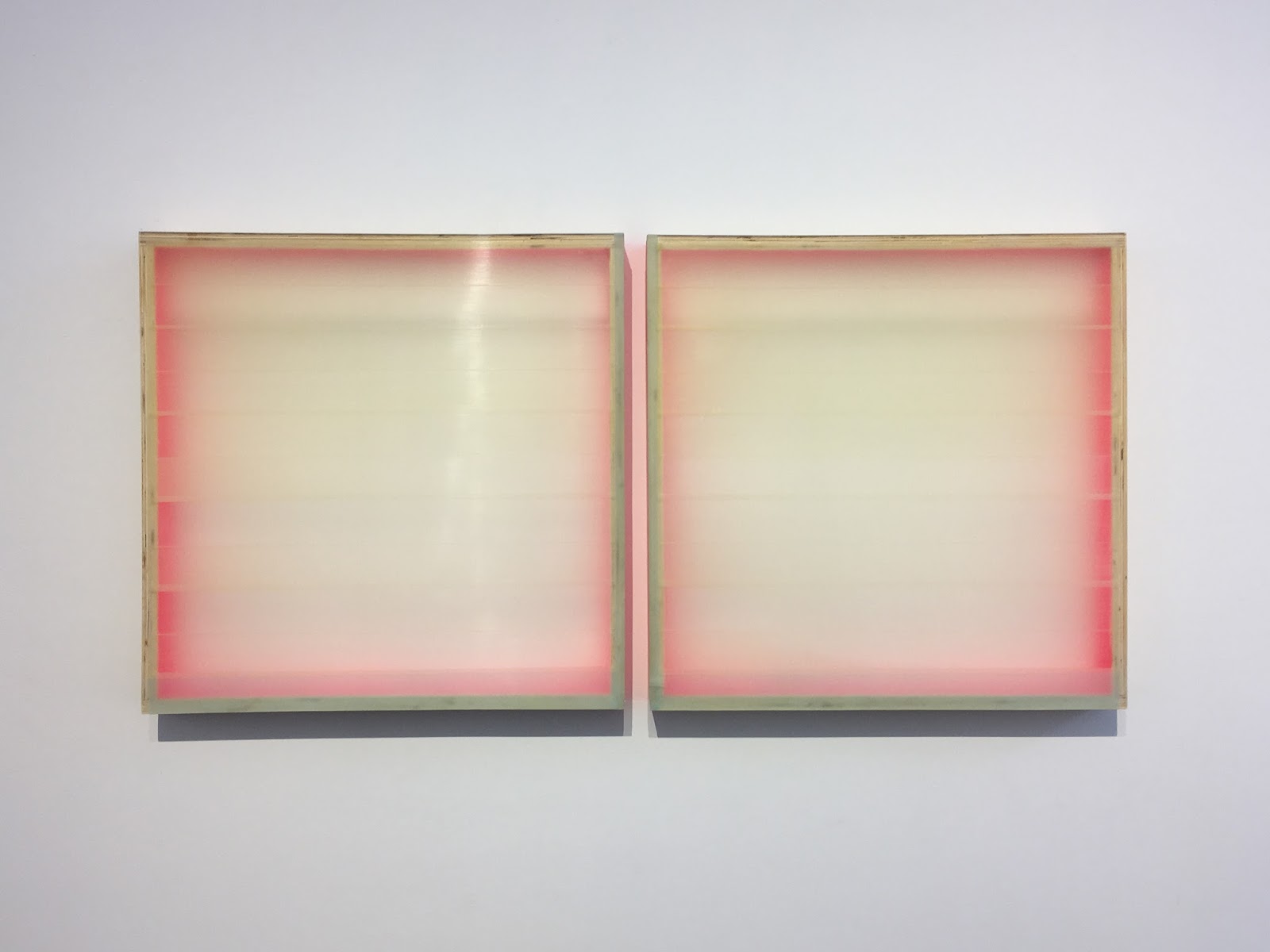
Heather Hutchison "Glowing" @ Louis Stern Fine Arts


Two Becomes Three, 2009-2011
Plexiglass (sic), birch, enamel, beeswax, pigment
23.5 x 49 x 2.5 inches


Under the Same Sky, 2017
Plexiglas, birch, beeswax, pigment, graphite, flashe, tape
12 x 30 x 3.75 inches


More Like the Weather: Faith, 2015
Flashe & Aura on Plexiglas
17 1/8 x 17 x 3 inches


More Like the Weather: Hope,  2015
Flashe, Aura, & Enamel on Plexiglas
16 x 17 x 4 3/8 inches


Tuesday, May 9, 2017

dayoutlast statement revision

 There is an assumption, based on the treadmill/hamster wheel of capitalist enterprise that things must be new, move quickly, and allow waste.  This website and my work functions against such assumptions because, I think it’s worth considering that things are not ever quite new but rather recycle/repurposed (or upselling to use the latest word to itself redescribed renewal); that things in their situational timeframe (think 18 yr single malt whisky, for example), that there are a variety of speeds of which high turnover is only one of them; and that to utilize every aspect of the resource (think whole buffalo) just makes good sense, albeit not as common as one might hope for. So, it is with this particular grouping of thoughts—renewal, variable speeds, and efficiency—that I ask you to consider the works here and the blog as a whole, an archive that functions at the pace called for by the work and my time related to it. Hence, dayoutlast, while initially the three most used words on my Facebook feed in 2009, now stands for the idea that sometimes we are barely caching a glimpse of what just happened. Therefore, this is not necessarily promotion, but rather, hopefully, attraction.

A critical aspect of my art practice, the activity of looking, thinking, analyzing, and judging. Also what things look like from a image (photographic) and text point of view. Comparing my vision with a technological one. Presumably realistic and accurate. However, context displacement. 

Saturday, May 6, 2017

Mary Weatherford "like the land loves the sea" @ David Kordansky


Daisy, 2017
Flashe and neon on linen
117 x 123 x 4 1/2 inches


Yellow exceeds the frame. Light extends beyond and bends. 


The photograph integrates the work. 


emerald underwater,  2017
Flashe and neon on linen
117 x 104 x 5 inches


Most striking deep red against pthalo green or viridian. Suddenly, tampon string and the stains which surround. 


Blue poles. Pollock. 


Jackson Pollock
Blue Poles, 1952
83 x 191 inches


Eden, 2017
Flashe and neon on linen
117 x 234 x 4 3/4 inches


Scale shift. The line does not integrate. It's a superficial appliqué. 
Not sure how the neon enhances the paintings that conjure Mitchell and Frankenthaler, albeit a horizontal orientation which emphasizes land over person (as the earlier AbEx painters would). Perhaps the lit line is the mark and reminder of the human. Yellow as representation of light juxtaposed with some version of itself. Phallic and formless(ness). Firmness. Formless. 


Butterfly, 2017
Flashe and neon on linen
117 x 234 x 4 1/2 inches


Light as distraction (subtraction) or addition. Arbitrary or intentional placement of light in relation to painted marks? The question, perhaps the very essence of this kind of painting. Splash. Waves. 


City, 2017
Flashe and neon on linen
117 x 234 x 4 3/4 inches


Complementary play between light and paint. Two separate yet simultaneously separate systems within perception and language. Passages that construct form in terms of painted marks through lights and darks. And so, the literal light juxtaposed signifies the emphasis. 


Animals, 2017
Flashe and neon on linen
117 x 234 x 4 1/2 inches


purple gecko, 2017
Flashe and neon on linen
117 x 104 x 4 inches


Mannered and spare. 


Arroyo walk, 2017
Flashe and neon on linen
117 x 104 x 4 1/2 inches


Tasteful neutrals. 


silver mountain cave, 2017
Flashe and neon on linen
117 x 104 x 4 inches


Rosalita, 2017
Flashe and neon on linen
117 x 104 x 3 5/8 inches


Application of paint v. Application of light. 

Endless, restless viewing the way sculpture works, the way these seem to be. 

Alchemy, Vulcan ritual, oil and water not mixing (flashe) the way light and pigment don't reconcile yet bind. Emulsions. 

At one point, Flavin affixed a light fixture to a painted support. How is this different aside from literal, nit picky distinctions, such as neon v. fluorescent, for example? 

Continual horizon(tal) quest... The line/light that divides. Like where the land meets the sea (see?).