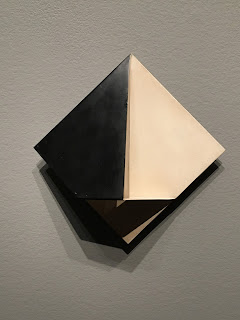
Lucia Koch
Light Corrections - Minus Green, 2017
site-specific intervention (light filters)
Lucia Koch
The Doors, 2017
site-specific intervention (light filters)
Leonor Antunes
discrepancies with M.G., 2011-2017
mixed-media installation
(cork, rubber and brass tiles with hanging rope and brass elements)
Clarissa Tossin
Ch-u Mayaa (Maya blue), 2017
HD single-channel video projection, color, sound
TRT: 17:55 minutes
Runo Lagomarsino
ContraTiempos, 2010
projection of 27 color 35mm slides
TRT: 5:24 minutes
Manuel Pina
On Constructions and Utopia II, 1999
16 gelatin silver prints
A fan of both Lucia Koch and Leonor Antunes, I was not such a fan of the tension that was created between their works in this exhibition. Both artists work relying intensely on subtlety, they clashed continuously as neither work was afforded a clear view on its own. (Perhaps this is an interesting point about boundaries and relations....?) Instead, by their proximity, one was always looking at one at the expense of the other. That concern aside, Koch's "interior" works were perfectly placed between doors on opposing sides of the central axis of this space. Antune's would have fared well in its own autonomous space, in the same way that a time-based work like Clarissa Tossin's or Runo Lagomarsino's were given isolated spaces. On that point, while Tossin's work certainly benefited from its own theatrical/cinematic space, it could have also functioned in closer proximity to others. Of course, I liked it the way it was, especially as the lights and darks required such an isolated view.
Unfortunately, these kind of installation decisions outweighed the ability to view most of these works with the kind of clarity that such quiet works often require. That fine line between appropriate threshold and boundary is an ongoing one, certainly as it pertains to built environments in general, especially those that would attempt to capitalize, or at the very least, conflate the relations between interior and exterior conditions, the ones modernist architects were quick to exploit in both south and north America, particularly southern California domestic spaces, rooted namely in someone like Frank Lloyd Wright. So, while the direct view suffered for many works in this exhibition, they were thematically on point including with respect to larger issues. Thus, for example, the overlaps as in Antune's fine lines and Koch's architectural interventions made the notion of intersection noticeably, and potentially fruitfully problematic.
Aside from this viewing challenge and associations about western hemisphere architectural developments over the past one hundred years or so, the works I share from Condemned to Be Modern were rather engaging especially as the proto-modernist architecture context pushed the dialogue further in the directions of architectural frameworks, site-dependency, and other referents within all the artwork that I embraced, the ones that were seeking attention regarding the conditions of place, conditions that perpetually persist, yet somehow seem worthwhile to improve.
Improve is one word; condemn is another. Are such terms opposing sides of the same coin? When I think of a condemned place, I think of one that is labeled to be destroyed, if not physically at least socially, banished perhaps. With the title of this exhibition, then, comes a certain kind of inevitability and acceptance about how pure ideas dissolve into layers and fragments of various realisms. Some continue; others fade into obscurity. Improvements may not be what they purport to be. Thus, this exhibition problematizes the issues more so than proposing any kind of solution. So, I can accept the lack of resolution (re-solution) in its fruition or lack thereof. That said, since Condemned to Be Modern seemed to revolve so intently around our built environments, it would have been nice to see more physical work, literally sculptural works built in the exhibition environment. This particular show would have also thrived with strategically constructed, temporary partitions, to be thought about more so as a kind of semi-permeable (passable) bridge, a structure to transcend two sides, inside/outside, past/present, north/south, and so on...


