When I started this blog, it was an art survey of sorts. It was a way to see what was happening. The photos that accompanied the viewing were somehow objective in the way that they spoke for themselves. Here was the show. See the snaps. Enough said. As time went by, my own inquiry began to evolve. It was not enough to provide an image, it seemed important to provide context with written content, even if they were fragments. Somehow, they qualified the image (as caption and notation often do). The interaction of text and image became clear enough (as if I had created a novel concept. I had not). It was just a way to internalize the development of looking between sensation and language. Most recently, the blog has continued to shift as the folding and unfolding of views inform the streams of consciousness, what I have come to realize is the process by which I view and understand artworks. So, streams and cadaver esqui.
Sunday, November 27, 2016
Saturday, November 26, 2016


Charles Gaines "Numbers and Trees: Central Park Series II" @ Susanne Vielmetter

Numbers and Trees: Central Park Series II: Tree #7, Laurel, 2015
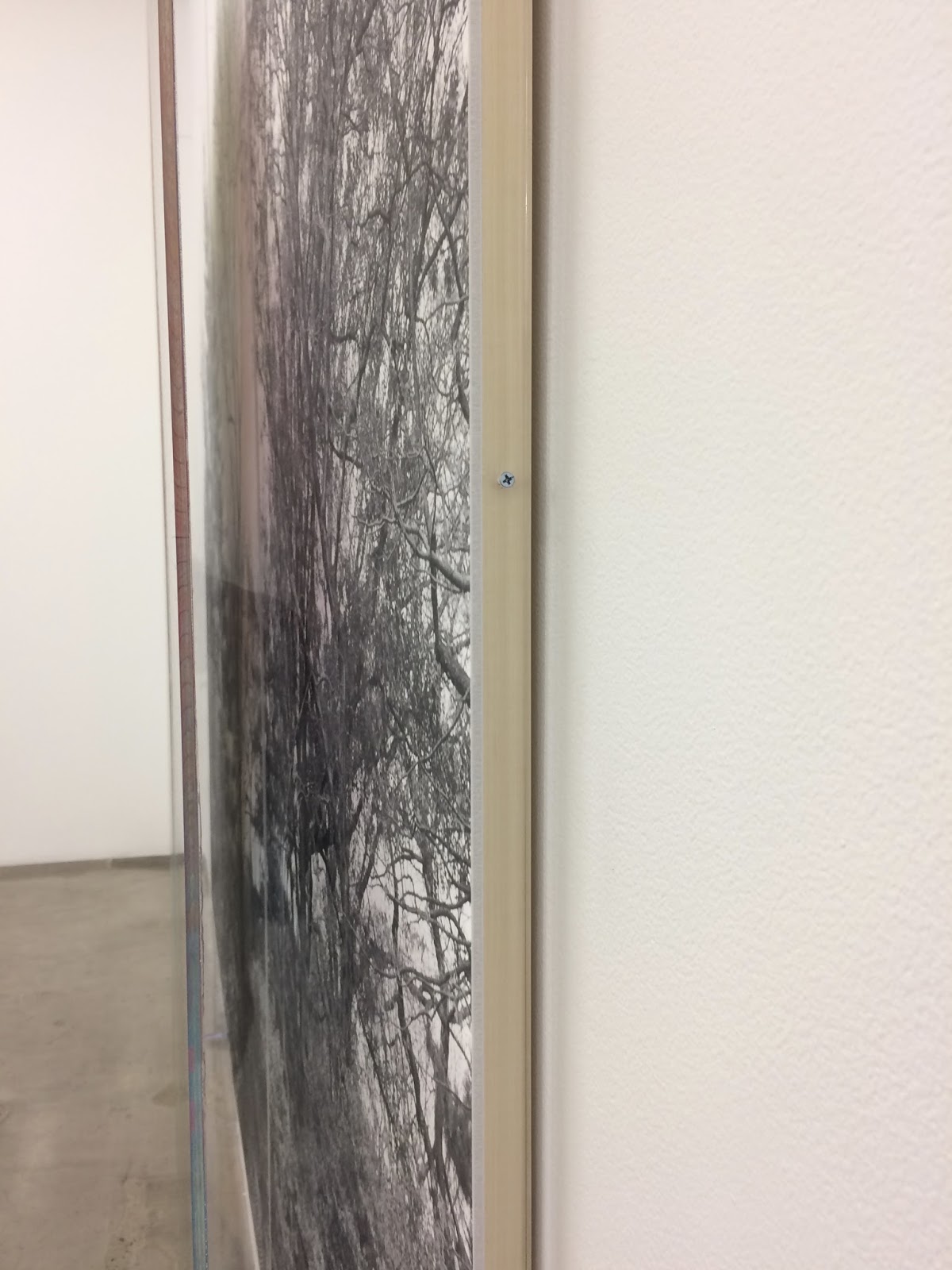
Black and white photograph, acrylic on plexiglas
3 panels overall, overall (2) 95 x 42 x 5 3/4 inches (1) 95 x 42 1/2 x 5 3/4 inches
Overall approximately 95 x 127 1/2 x 5 3/4 inches

Like a barren tree in winter when the only thing left is the essential structure, even in life, they appear black and white. So, the colored squares, like leaves on a tree, being body and life as they obfuscate structure. A wider spectrum of color where there is none. Painting over photography.


Numbers and Trees: Central Park Series II: Tree #8, Amelia, 2016
Black and white photograph, acrylic on plexiglas
3 panels overall, overall (2) 95 x 42 x 5 3/4 inches (1) 95 x 42 1/2 x 5 3/4 inches
Overall approximately 95 x 127 1/2 x 5 3/4 inches


Numbers and Trees: Central Park Series II: Tree #5, Lucas, 2015
Black and white photograph, acrylic on plexiglas
3 panels overall, overall (2) 95 x 42 x 5 3/4 inches (1) 95 x 42 1/2 x 5 3/4 inches
Overall approximately 95 x 127 1/2 x 5 3/4 inches

To read these as pictures brings issues of landscape to the front despite being, literally, toward the back (the second, distant layer). It's also telling of something that few if any figures appear, and, when they do, are distant and merged seamlessly into the mise en scene.


Low horizons.

Numbers and Trees: Central Park Series II: Tree #3, Susanne, 2015
Black and white photograph, acrylic on plexiglas
3 panels overall, overall (2) 95 x 42 x 5 3/4 inches (1) 95 x 42 1/2 x 5 3/4 inches
Overall approximately 95 x 127 1/2 x 5 3/4 inches

My holistic nature, the one that wants everything to collapse/cohere into a single, undeniable and simultaneously undefinable moment, would rather see these works as flat, singular pictures when and where there is one image not behind any kind of glazing. So, in my own photographic documentation, I crop some of them as such and ask questions (granted, the plexiglas divisions persist). Why not draw grid lines and paint directly onto the photograph? Archiving issue? Why not use one plexiglas panel? Why must the works be divided into thirds? Industrial manufacturing limitations? Stock sizes? If so, then why do they need to be this large? If divisions are essential, why thirds as opposed to fourths or just about any type of metric? Certainly, measurement is integral to these works whatever their presentation requirements. Interesting how practical questions can lead quickly to what might be essential, that is to say central issues in artworks. (I'm not sure what to call them other than mixed media, which I consider a significant limitation to what I think might be important about them in terms of time and place. Nowadays a material inventory seems to suffice). But, centrality.
If a tree is central in each work and each work's subject is Central Park, then perhaps there is more at stake with the structure: size, materials, media choices, presentation. It's also interesting to think about these framed divisions in relation to altarpieces or just about any narrative that would embrace three acts. In reading these works left to right then, the central panel has the same kind of density that a tree does with the branches thinning in either direction left to right. This natural growth model seems to have other metaphors: imagery of a head (cerebral activity); bell curves (organizing data sets); and any other tool of plotted points for that matter (given systems and constructed organizations). So, I am thinking about art history, religion, storytelling, past works of Gaines (black and white portraits from the Seventies, institutional metrics, and even Frederick Law Olmsted and Calvert Vaux, the designers of Central Park, one of the largest bucolic settings mapped onto an urban US landscape; plus, intelligent design at large (sublime to be sure). Granted, when Central Park was "installed" in 1858, it would have been more like two natural layers: the existing one and the designed one. So, layers.
This layering seems to be critical for Gaines, whatever the layers and whatever the meanings actually are as they pertain to both natural and cultural histories. So, when I choose to collapse them as one (in my mind, in my own photo cropping), it is my preference to synthesize layers rather than leave them analytically separate but somehow equal. If not equal at least dimensionally, each layer is clearly separated. Layer one as I look at the works is a grid of color (the one closest to a viewer); the second layer is a black and white photograph. Conversely, from the perspective of the maker, the artist, layer one is the photograph and layer two is the carefully painted grid with the color black appearing in both the photograph and the structure of the painted parts. A black and white foundation seems essential here as it may pair with the drawn lines of the second layer. Impressively, a color photograph would have been potentially magnificent as fall colors would, but the artworks would be something else entirely, if not redundant and disconnected. So, tenuous connections/relations beyond lines and layers, it's also worth noting that the fallen leaves indicate a time of year which offers its own metaphor and symbolism, for distant figures, for a bodies of work, for bodies of all kinds individual and collective. Arguably a stretch, certainly it is thin connection between layers, whichever direction you wish to consider them, that is worth considering both literally and figuratively.
Before there was plexiglas and even glass over artworks, there were painted layers of glazed oil. For some, oil painting marks the beginning of painting as we know it, a kind of panting that is largely figured out spatially and rationally, at least until the photograph was introduced. Then, photography displaced painting as a responsibility for reality, certainly the kind of reality that the average human desires in terms of reproducibility and imitation. I'm a little off track here, but it's worth noting the historical intersection of photography and painting in order to appreciate how these works appear, at least on the most superficial formal levels. Again, layers: leaves falling like paint, and sequencing too.
Repopulating these trees with gridded, multicolor "leaves" brings an odd awareness to the contrast between photo and painting as well as analog and digital progressions; the painted colors have clear relationships optically with colors achieved through digital technologies. So, many things to consider here... history of painting, photography, therefore, technology, humanity, nature, systems, reason, lack thereof... Once we get past the surface logic of these works, we realize that the same formal concerns due all pictures are in play. Getting behind the surface may actually be the entire enterprise of these works, works rooted in systems both natural and cultural.


Subscribe to:
Posts (Atom)