dayoutlast is a record of my direct engagement with mostly contemporary art, mostly Los Angelean.

As this blog has evolved since its 2010 inception, so has my perspective. What I once perceived as central within the investigation was what was central, literally, within the photographic frame that I shared here. While still an important consideration, such thinking has also given way to more peripheral considerations, ones also accompanied occasionally by text (written manifestation of thought) and the oscillations between them. What's missing here are larger unknowns surrounding issues of presentation and representation; the amount of time and space it actually takes to accomplish such first-hand observations; and the quandaries between documentation and interpretation.

Despite my attempt to communicate here with image and text what is essential in some respect about the artwork, neither representation should ever be considered a substitution for the primary viewing experience. Of course, occasionally there are exceptions.

Most of the time, these posts are merely remnants---residual fragments---from my last day out.

Friday, October 27, 2017

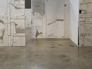
Pablo Rasgado "This Too Shall Pass" @Steve Turner


Leo Marz
Las batallas del display (STC01), 2017
Acrylic on canvas
71 x 46 inches


Kelly Kleinschrodt
restkonstellation I, 2017
Photogram in artist frame
Ed. 1/2
20 x 16 inches


Emilo Chapela
Euroasiaamerica, 2014
Lithograph
Ed. of 15
19 3/4 x 27 1/2 inches


Pablo Rasgado
Arquitectura Desdoblada (CGM), 2011, 2012, 2015
Drywall and acrylic
78 1/2 x 78 1/2 inches


Pablo Rasgado
Arquitectura Desdoblada (CGM), 2011, 2012, 2015
Drywall and acrylic
72 x 96 inches

Fanny Sanin @ LA Louver


Acrylic No. 1, 2015
acrylic on canvas
44 x 42 inches


Acrylic No. 1, 2013
acrylic on canvas
60 x 44 inches


Acrylic No. 2, 2008
acrylic on canvas
40 x 44 inches

Color at the fore. Insistent, persistent as it organized around structure, frame, regularity and predictability. A process of refinement and restraint, an apparently logical progression as elements and terms are taken one at a time formulaically. 


Acrylic No. 2, 1998
acrylic on canvas
52 x 48 inches


 Acrylic No. 7, 1981
acrylic on canvas
62 x 68 inches


Acrylic No, 2, 1981
Acrylic on canvas
28 x 40 inches

All color no light or all light. No shadow only it’s depiction as darkness.


Acrylic No. 11, 1979
acrylic on canvas
66 x 66 inches


Acrylic No. 4, 1977
acrylic on canvas
44 x 54 inches


Acrylic No. 2, 1974
acrylic on canvas
65 x 92 inches


With my first survey upon entering the first gallery, I was drawn to this one above.  What I thought was an odd deviation from an otherwise well-orgnanzed painting was, upon closer inspection, a fly sitting in the surface; it wasn't a blemish or some other as it first looked.  Whatever the case, it was curious in its position at the intersection of the red, white, and blue. Something struck me humorously  about this, something about the odd situation at a corner or I don't know what.


Oil No. 4, 1967
oil on canvas
70 7/8 x 61 inches


Acrylic No. 2, 2008
acrylic on canvas
40 x 44 inches

As a relevant aside, I was smitten by the work of Mark Rothko as an undergrad many years ago.  It was something about the moments of light within these sfmuato/all-over painted surfaces, surfaces that yielded to a faint, literal structure beneath.  Several years later, upon seeing a retrospective in New York in 1998, I was caught a bit off guard in all the best ways by Rothko's earliest works, biomorphic abstractions which were so much in the style of the time (the 30s into the 40s) as inspired by the likes of Joan Miro, Arshille Gorky, et al.  Old news by now, this was the period of key transitions namely expatriate European artists moving to New York simultaneously giving rise to AbEx painting.  So it was seen with Rothko, also can it be seen in the evolution of Agnes Martin, John McLaughlin, Frederick Hammersley (a staple of the LA Louver program) and now also Fanny Sanin.

So, it is something about the way organic expression and spatial searching gives way to ordered, structural canvases.  Whereas Rothko exemplified the substructure without giving way to flatness completely, Martin to the meditation of ritual mark-making, McLaughlin to architectural framing/verticality, Hammersley to color and sequencing, Sanin takes up most clearly the issue of symmetry thereby not only reflecting a faint facial configuration but also the bifurcations of insect perception and bio-skeletal fragmentation structurally speaking which may, possibly, be influenced by my encounter with a fly upon initial viewing of these works. That idea impossible to prove/disprove, there is something in the organization of these paints that seems to continually revert to seeing or what obstruction can not be seen. This idea seems most prominent with the most recent painting, the one that I share first at the very beginning of this post.  Many of the recent works, utilizing angles, allude to something insect-like and also a slight return to the earliest organic works, the tangents affording approximations of a curve.  Whatever the associations, something front rather than aerial seems in play which contrasts with someone like Peter Halley who also enjoys the odd juxtaposition of line and shape relations to obliquely suggest connections and systems, yet another kind of structure.

Aside from the formal composition, framework, and point of view, it's worth noting a color palette in these works that persists from the earliest one from 1967. In fact, if you were to look at the last two paintings side by side, they are almost proportionally similar in terms of distributing each hue.  Obviously, this is too clean an observation, but it does speak to how the initial splatter has been arranged into such compartments over a fifty year span. This evolution within a single painting practice is worth considering on its own and in conjunction with fellow painters and history that attempts to find that harmony between emotion and logic, soft and hard-edge, geometric and organic, and so on. Just as the persistence of idealized symmetry, so the struggle in the bifurcations of differences between such things.

Lucia Koch "No More Things" @ Christopher Grimes


Cat Food, 2017
pigment print on cotton paper, UV matte laminate
91 3/4 x 44 1/4 x 1 inches


Work space. 
Space of occupation. 
Cubicle. 
Productivity without product (an important question for art to be sure).


Vertical/Horizontal.
Circle/Square.
Reconciling dualities just as door/window, flatness/depth, light/shadow, utility/aesthetics, etc...


Cleanser, 2017
pigment print on cotton paper, UV matte laminate
44 1/2 x 68 3/4 x 1 inches


A view onto nature.


Helmet, 2017
pigment print on cotton paper, UV laminate
44 1/2 x 61 5/8 x1 inches

Irregular aperture is a nice variation from the more typical and convenient basic geometries that seems to pervade such forms. Thus, there is a greater balance between organic/inorganic formally and therefore conceptually.


Green Juice, 2017
pigment print on cotton paper, UV matte laminate
44 1/2 x 28 7/8 x 1 inches

Conjures James Turrell and the apprehension of light through apertures...Asserts optics, space, time, and movement between such things.


Dori, 2017
pigment print on cotton paper, UV matte laminate
32 1/2 x 73 3/4 x 1 inches


Pao, 2017
pigment print on cotton paper, UV matte laminate
87 3/4 x 48 1/8 x 1 inches


Frame color integrates with pictorial space thereby suturing the virtual space of the photograph with the actual space of the gallery, itself an immersive pictorial realm in this show.


Seeing the large in the small, the intimate in the mundane (quotidian objects or their relative absence) is a familiar subject not just to art and its history, play more generally, but also to my own art practice which utilizes architectural frameworks and its signs to embrace phenomenological conditions noted through the passage of time and light while simultaneously flattening such remote, abstract concerns with grounded realities such as those found in cardboard boxes, here appropriated/repurposed artifacts presumably from a recycling bin. At least, I'm assuming that Koch is not fabricating these boxes specifically for these photographs. The beauty in their modesty and happenstance (readymade) qualities would be deflated by such an invented intervention, though a certain redundancy/inefficiency, might actually be a nice friction/deviation from the expected. (In the way that Thomas Demand works).

That said, I get the feeling these photographs are more about the joy of discovery and imagination just as a child or even a cat would encounter an empty box.  In fact, one of the titles as Cat Food connects this to me in multiple way not the least of which is a tempting adage such as cat out of the bag or similar.  Cat Food is the one I like best here, likely because of its subtle, material relationship to light and color not to mention its integration within the exhibition space which such together sets up a complicated set of relations between presentation and re-presentation. In fact, this seems to be toward the essence of these works, photographs that are scaled and hung like architectural features themselves (doors/windows).  While I have been talking about the subject and a suggested space, the works themselves are (obviously) only a proposal for such intimate spaces, again spaces afforded by every day detritus, the results of mass, commercial endeavors of all kinds, not things as the shows title suggests.

Whatever the space we occupy as viewer, tt’s fun to play with model and scale while viewing these works.  The proposal of modest, found materials, as exceptional interiors is quite seductive for some of us. How light informs/interacts with such spaces is appealing as well. That’s the space of representation, photos that depict the illusion of depth and invite conceptual participation. A bit of a tease, more so as a result with how some of them are hung and any kind of direct involvement, they still seem to operate similar to how a distant James Turell would, as one example. Part door, part window,  quiet, contemplative, warm, light-effect mediations, one is held in a similar kind of balance between seeing and being, again remote like childhood memories of building within such cardboard worlds.  On a slightly different note, who knew cardboard would become such a hot commodity as it pertains to the world we live in over the past twenty years or so? In a pre-Amazon world, its ubiquity and value could not possibly have been predicted. 

Slightly disenchanted by the specificity implied in the titles myself,  I doubt it matters what the former contents of these shells (packaging boxes) were nor is it indicated directly in the work. All the signs of the works within and without speak clearly enough on their own terms while also inviting interpretation  Perhaps rather than feeling disenchanted, what I mean to say is disappointed, because the titles seem unnecessary and only ground/distract the work from its seeming aims in terms of light, form, and space (and I'm basing this on previous works that I have viewed by Koch at this same gallery (see here)). So, knowing the source of these boxes, what they refer to momentarily in the commercial exchange, does not heighten my experience in viewing them; they come as more of a distraction because we already get, by the photographs themselves, that these are cardboard boxes, things with which we are more than familiar in all their forms, and they are just as ephemeral as the phenomena which are housed within them.

On the other hand, the titles with the boxes may do something more. They may signify in their specificity a human, and quite possibly, a concern for thoughts about a post-human condition.  Slightly skeptical of this dystopia in vision, the absence of products and therefore industry simultaneously produces human as product, which can be a slippery and frightening alternative to the current situation, which may be at the root, I believe, of Koch's concerns, concerns that seem to value the presence of human interaction despite what all the visual absences celebrate.  Alas, I viewed and contemplated these works alone.

Saturday, October 21, 2017

Julian Stanczak "DUO" @ Diane Rosenstein


Succession, 1989
Acrylic on canvas
60 x 60 inches


Offering Violet, 1970
Acrylic on canvas
70 x 60 inches


Mystic, 1976
Acrylic on canvas
38 x 28 inches


Touching Purple, 1986
Acrylic on canvas
70 x 70 inches


Interactive, 1989
Acrylic on canvas
44 x 22 inches


Offering White, 1991
Acrylic on canvas
33 1/4 x 24 1/8 inches


All the complications of vision are present with these works, paintings that reference color, pattern, and rhythm.  The restlessness of of each one reminds more about the value of a present moment as they eye continuously shifts to locate something.  Such was the movements of earlier Op Art attempts  as well. If the tension of structure and contrast within each is not enough in terms of line and shape, then color itself can be seen as complicated within the viewing experience itself AND my photographic representations. If you look at the first image, both the whole composition and my details reveal the diversity within a single image. If that's not enough, the camera's inability to grasp some kind of "truth" about the primary viewing experience should also be cause for contemplation.  Such a medium and the media it represents ought to be taken in proper context and perspective not for a means to a simple end of pleasure (but partially why not and in spite of my own partial distaste of these, partially because most won't look past the Op dazzle and partially because they are too uniform in my opinion) BUT rather too consider the symbolic language offered here about how something as seemingly simple as color, form, and pattern can give way to complex thoughts about difficulties of understanding, perception, and possibly how such things change over time.  Taken together over a thirty year period, it is also remarkable to consider the shift, slight as it is within a single body of work, one that asks how to ponder and reconcile the relations of two or DUO as the exhibition title states. Just compare the first two paintings in this post as a starting point; they are twenty-nine years apart yet could have been made the same day off the same palette. Change and an understanding about change is subtle at best.