Untitled, 1955
Oil on masonite
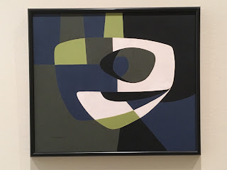
Framed by the doorway on the approach toward the exhibition, this painting above stood out. It also maintained the closest proximity to my current interests about the perception of space in terms of light and dark as it both illuminates and obstructs. So, it makes sense that I take the time to parse the composition of the painting above into so many fragments. It can be endless as it gets to the heart of abstraction as a completely scalable and unwieldy aspect. It's a bit of a rabbit in the hole, unless there is something tangible, in this case, frames.
Here such notions of light are formalized concepts in name more so than any actual, visual depth, via value or any other kind of spectral shift. Yes, more of an idea, a point of departure for contemplation. That said, it's clear that framing and lit space work together throughout the exhibition to at least suggest some literal, perceptual aspects. For example, upon viewing a didactic panel of McLaughlin's dimly lit studio later in this exhibition, it's clear that architectural framing played a strong role in his paintings. As such, it's difficult not to take in such external architectural gallery conditions (floor, ceilings) of this exhibition also, especially when complicated by the inclusion of Roy McMakin chairs, curiously positioned in relationship to certain paintings. So, paintings, furnishings, and architectural space were held together in some kind of balance that forced a much slower read of this exhibition than one might have otherwise anticipated. Whether or not these external elements would be welcomed by the artist, it certainly was a curatorial ploy that played well even as it extended into and obstructed the viewership. As such, I couldn't help making extra connections, at the very least symbolically, based on color schemes and patron outfits, etc... Such is the danger of opening the door to external conditions, again, an argument made more so by the curator than anything that McLaughlin gives us. He seemed very clear about the framing and his intent to work around, mostly side to side, within the frame. Whatever the case, it was through such lenses that I enjoyed the show up to and including Ed Moses' remark in the museum video describing the paintings poetically and poignantly as kind of "yim and yam."
If it wasn't enough to be thinking about paintings and architecture, there was also the fact that in these very spaces, another painter, Agnes Martin, of similar time and formal concern as McLaughlin, was shown in these very galleries last fall (see here). Both McLaughlin and Martin worked through a history of painting that started with the organic biormorphism of the early 40's and stretched through several decades to some version of geometric abstraction (to be appreciated conceptually as much as formally in my estimation). So, there was a strange echo throughout the exhibition, in some instances, to the very gallery space and how it was used and circulated, chronologically, clockwise from the elevator vestibule.
Chairs that seat one rather than a few.
Untitled, 1953
Oil on masonite
While the earlier 50's paintings seem to make structure essential via form and contrast, later works employ color (always a reference to the times, what was available/possible according to production at the hardware store as well as artistic development within a painting practice with basic variations of primary combinations). So, how black and white interact with basic color combinations. Titles that reinforce logic (an objective numbering system, mathematical order/process (sequence). Seem to be straightforward enough. Aspects also recall his local contemporary Frederick Hammersley, somehow, though in the latter it's much more about the reordering of space rather than relational progressions. Cf. Hammersley cut outs (see here).
#17-1962, 1962
Oil on canvas
#9-1961, 1961
Oil on canvas
#15-1958, 1958
Oil on canvas
#22-1959, 1959
Oil on masonite
Untitled, 1966
Oil on canvas
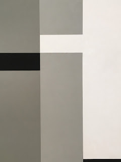
Black and white vertical strips move from edge to center, almost giving dimensional form if seen as light and dark upon a vertical, rectangular prism, for example with the light blue and unmodulated sky. Value (and therefore light, a relational spectrum) appears as an idea rather than as an actual visual phenomena though there are moments. Space divides clearly, and so ideally, conceptually.
#17-1963, 1963
Oil on canvas
Mirror in chair faces painting of increased illusional dimension. Door/Window dilemma. Flat painted or infinite painted surface.
Roy McMakin
Twelve Chairs Made for the Occasion of a John McLaughlin Retrospective
at the Los Angeles County Museum of Art, 2016
Wood and Mirror
Looking at painting and looking though the back of chair reflect one another as framing devices. Again, the window frames of McLaughlin's studio are pronounced. Again, the value change from light to dark suggests depth but not. The door and window conversation of painting persists.
316-1963, 1963
Oil on canvas
#9-1966, 1966
Oil on canvas
How an object (such as a chair) sets up a pivot point. Black emphasis. Few horizontal compositions.
#10, 1965
Oil on canvas
Allows the viewer space to see what the viewer sees. The height of the chair being close to the perspectives height of the paintings in a wider, gallery view. Or rather, the height a chair is the bottom hanging height of many of these paintings. So, a human element is conveyed within the viewing relations of the show as much as in the vertical orientations of most canvases. Metrics of design factor between painting sizes, hanging heights, viewing standards whether standing or seated. These are relationships that don't integrate physically, but do so in the mind.
#5, 1974
Oil on canvas
How art-viewing spills into adjacent life as we are attuned to verticality and color-framing throughout the show, especially black and white (hair, clothing, et al).
#12-1970, 1970
Oil on canvas
And then there is this leap in the exhibition between the latest works and the earliest ones, not obvious as a possible first stop as the exhibition is laid out because these 40's paintings and works on paper were shown in a dingy closed off gallery between the beautifully lit other sections. Viewing conditions aside, it's important to note the early interest in primary shapes, form, and organic tensions, again, recall Agnes Martin also working during this time period on the other end of the continent.
Untitled, 1947
Oil and casein on panel
Untitled, 1949
Oil on board
Untitled, 1950
Casein and oil on board
Untitled, 1951
Oil on masonite
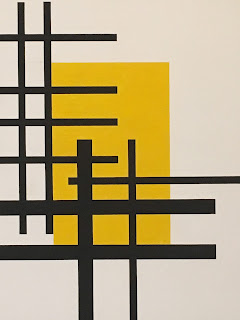
Abandoned overt curves and angles. Remote, interior light.... Yellow, a well-understood representation of light is held at bay by black, linear structures, spatial divisions. Rather than immersed in light, there is a kind of distant, eternal darkness that pervades McLaughlin's work no matter the palette nor compositions, and this seems to hold with his interest in void, especially as these works seem to also conjure shoji screens and other elements from the land of the rising sun. A curious interest given the politics of this decade... (and perhaps too much of an aside).
Untitled Composition, 1949
Casein on Masonite
Trying to let go (finding a way to end the relationship) as a viewer with art like this is like an artist's output over a lifetime as it removes distractions and simplifies (Cf. De Kooning at L&M, for example. See here). So, like all things, theres seems to be a gradual rise and fall its sequence, and it's remarkable to witness by such a disciplined practice that, despite whatever distractions external or othwerise, seems clear about it's attempt to focus on less tangible aspects of our being within the space of modestly-scaled paintings. Perhaps focus itself is to the point?


No comments:
Post a Comment