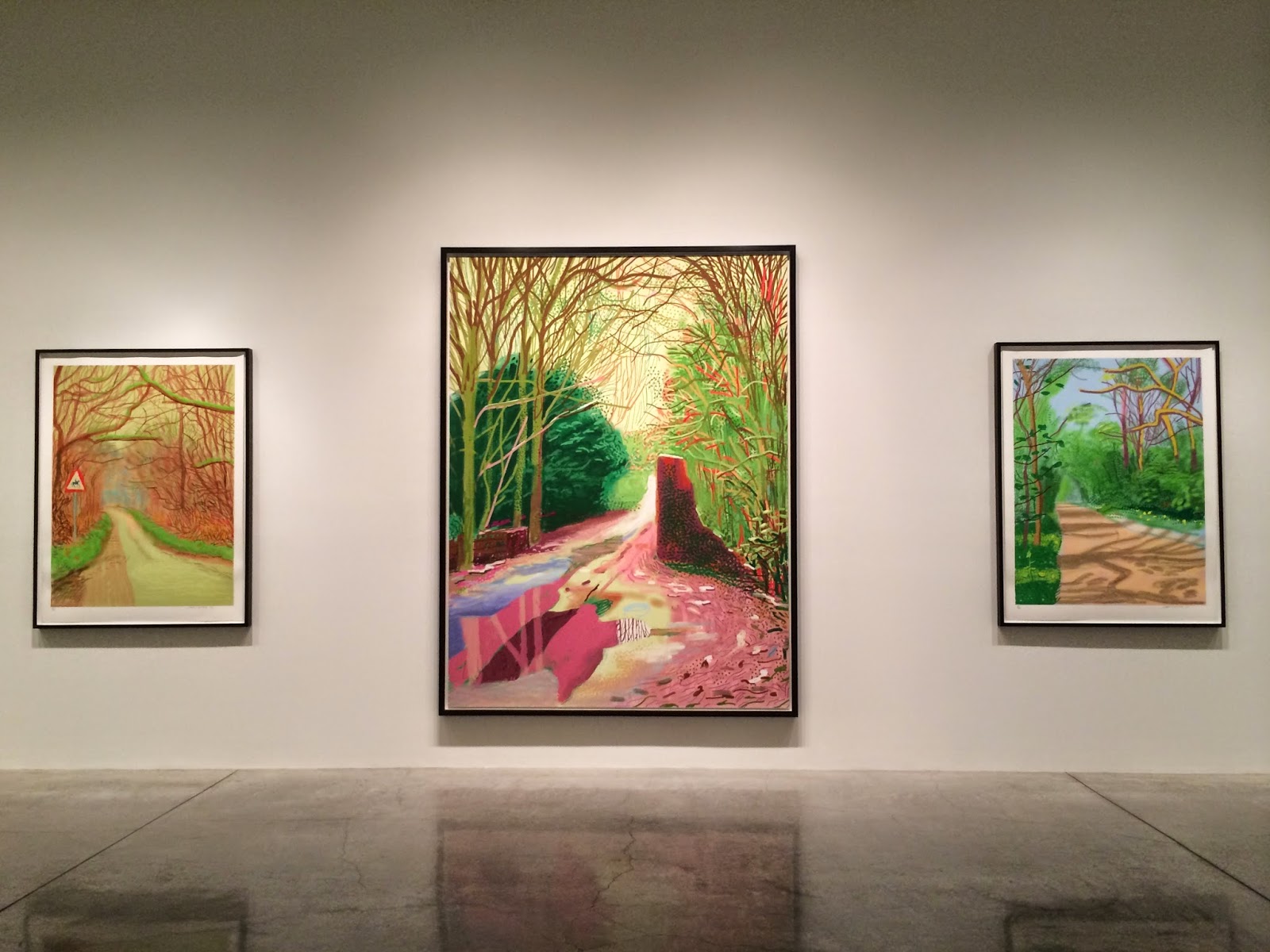
Much has been made about green in the annals of art history. This show exceeds and defies all the rules, per usual for Hockney particularly with regard to color. Still looking down the road, this time with less of a worldview (Mulholland Drive) or fragmented and remote (Pearblossom Highway) or even SoCal for that matter (pools and midcentury homes), and yet all the signs of painting literal and figurative connect with how we move through space with some assisted mode. Hockney's persistent interest in pictorial technologies (camera obscura, fax machine, automobile) takes the form here of so many pixelated (or should I say pixilated) marks. Did he design these on his iPad first? [Note: I came to this show with a very cold read, and so my primary viewing preceded any subsequent research as this iPad observation attests]
A little Bob Rossy at times... Verdant, mottled, landscape picturesque.
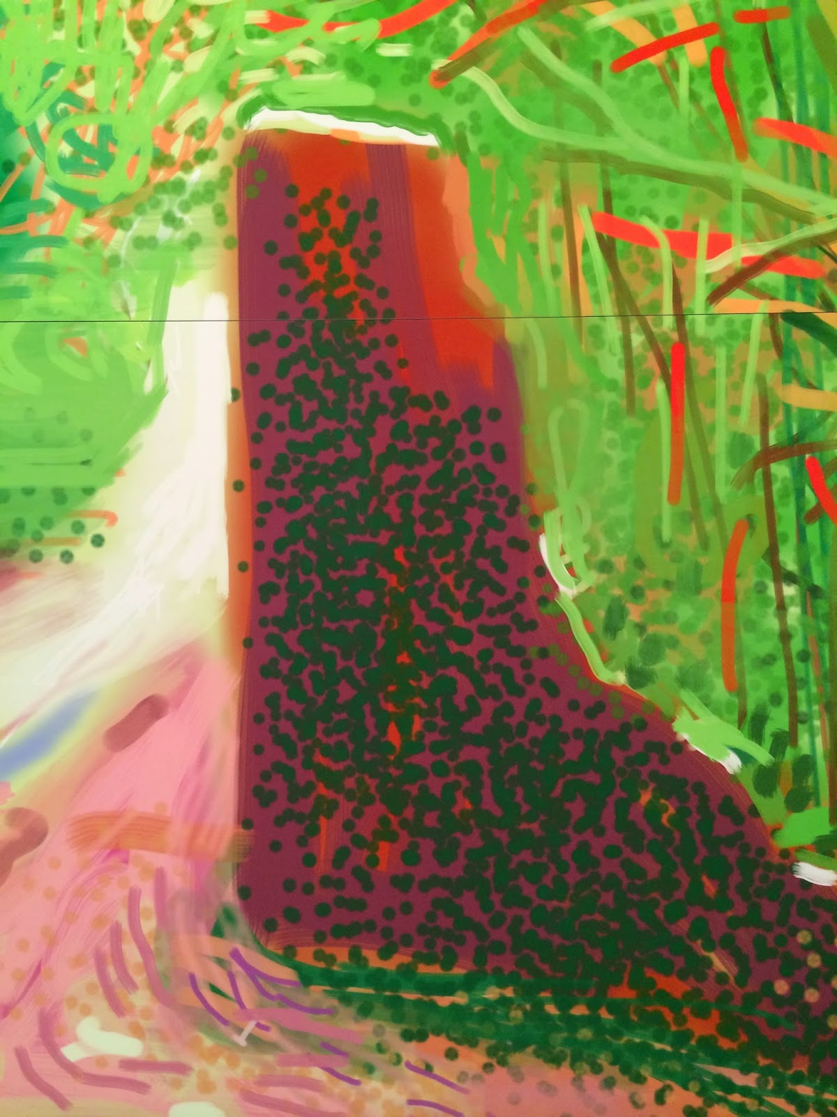
Larger, multi-panel works recall his continuous depiction of parts and whole from previous bodies of work but now with a more cohesive pictorial space. Note: the paper sections in the detail below.
Pastoral. Only signs of industrial in the way of signs, actually. Equine mobility and pace in the making and the viewing? Mine was, perhaps even more like pedestrian.
Palette and movement of Van Gogh, not to mention his bold, ballsy, brash use of color, however much lighter in touch here. The gestural lightness of later De Koonings come to mind.
The reflective and projective of what lies ahead at the end of the road. Seasonal shift (impressionist, temporal concern). Painted marks almost characters suspended as dashes of spotted rain.
Telephone/power pole (one without wires) appears quaint in this setting, though "brush marks" all appear wiry enough. Again, light of a light touch.
Curious bits of color hover. Skies of yellow, peach, periwinkle, heliotrope, lavender (Fay?). No, just light.
Certain size marks are so Van Gogh in terms of mark to depicted object.
Blown up and pixelated, pixilated. Mondrian's Woods Near Oele, 1908.
At last, light, technology, and medium have fused. Indeed, iPad was made for Hockney. Just as the tool, the iPhone (the one I use to scrawl these notes and share these images). I suppose the only question becomes one of restraint, how to frame and just when to end. The painted road doesn’t seem to.


No comments:
Post a Comment