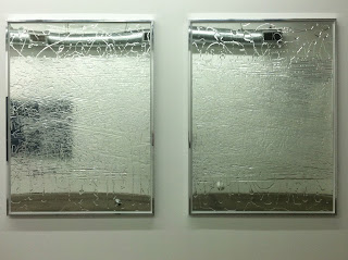
Supposedly August is a quieter art month, one that only those without a wonderful summer itinerary should venture into gallery-wise. Or so, the story goes. As it were this past one, there were more than a handful of worthwhile objects, installations and pleasant surprises to ponder (see the previous run of posts).
This next weekend marks the start of another art season. Stay tuned.
dayoutlast is a record of my direct engagement with mostly contemporary art, mostly Los Angelean.
As this blog has evolved since its 2010 inception, so has my perspective. What I once perceived as central within the investigation was what was central, literally, within the photographic frame that I shared here. While still an important consideration, such thinking has also given way to more peripheral considerations, ones also accompanied occasionally by text (written manifestation of thought) and the oscillations between them. What's missing here are larger unknowns surrounding issues of presentation and representation; the amount of time and space it actually takes to accomplish such first-hand observations; and the quandaries between documentation and interpretation.
Despite my attempt to communicate here with image and text what is essential in some respect about the artwork, neither representation should ever be considered a substitution for the primary viewing experience. Of course, occasionally there are exceptions.
Most of the time, these posts are merely remnants---residual fragments---from my last day out.
Saturday, August 31, 2013
Jessica Stockholder, "Zee," 2013 @ 1301PE
Zee, 2013,
chain, blue foam covered flooring boards, light fixture base and top, green bulb, green electric cord, brown electric cord, light chain, and hardware installed to ceiling
31 x 65 inches
Friday, August 23, 2013
Lucy Dodd @ Blum & Poe
Thursday, August 15, 2013
Matthew Cerletty "Kitchen Island" @ Blum & Poe
I include this here because I want to make a point about abstraction, figuration and scale. With the presence of a human body, abstraction is reduced to surface pattern and decoration in this instance. Rather than infinitely scalable to include other things, it's just background and wall paper. I liked looking closely and not thinking about anything with the first three images here. I'm assuming if you didn't know the work or I hadn't told you, you could consider them as three separate works rather than progressive details. Such is the relationship to photography and abstract/non-representative painting.
With the inclusion of a forward figure (a reference point), I am faced with a confrontation and perhaps nothing else about the artwork. On the other hand, such works within the same show (abstract and figurative) may be making just this point albeit an academic one. Perhaps a greater synthesis between foreground and background would make for a more realized painting. Then again such a cut and paste aesthetic may also be making a point about the technologies of our time. Unfortunately, I am not given enough information here to answer this definitively. Certainly, in hindsight, selfies in front of paintings have really become a "thing."
Saturday, August 10, 2013
Subscribe to:
Comments (Atom)


