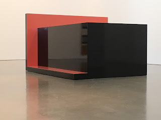
Planar Configuration Three [#3], 2017
Powder-coated steel and aluminum, cushion,
weaving, newspaper
50 1/2 x 83 7/8 x 91 inches (128.3 x 213 x 231.1 cm)
Proper viewing height may be like a small child. Or wheelchair or similar.
Suffers the loss of lighting distractions. Something that would register very differently if surfaces were non-reflective AND lighting systems were not present. Perhaps natural light in the way Judd set up Marfa…
Or simply an issue with work that absorbs its environment and fosters long views in order to consider the whole in relation to the parts. Either each part is its own whole or it works as a group, which I believe is the question embedded (pun intended) in this work. The one and the many and ones relation to one and an other, which is to say another or possibly other. Or should I say many’s relation to such things…?
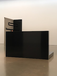
Planar Configuration Four [#3], 2017
Powder-coated steel and aluminum
71 5/8 x 66 x 134 inches (181.9 x 167.6 x 340.4 cm)
Dimensional work that fosters flat, frontal views.
Study for Planar Configuration #4, 2017
Wood and paint
37 x 26 x 6 1/2 inches (94 x 66 x 16.5 cm)
Study for Planar Configuration #5, 2017
Wood and paint
38 1/2 x 26 x 5 1/2 inches (97.8 x 66 x 14 cm)
Study for Planar Configuration #1
2017
Wood and paint
24 x 24 x 5 1/2 inches (61 x 61 x 14 cm)
Study for Planar Configuration Variant #1, 2016
Gouache and watercolor on paper
Framed Dimensions:
27 5/8 x 34 7/8 x 1 1/2 inches (70.2 x 88.6 x 3.8 cm)
Study for Planar Configuration Variant #2, 2016
Gouache and watercolor on paper
Framed Dimensions:
27 5/8 x 34 7/8 x 1 1/2 inches (70.2 x 88.6 x 3.8 cm
Study for Planar Configuration Variant #4, 2016
Gouache and watercolor on paper
Framed Dimensions:
27 5/8 x 34 7/8 x 1 1/2 inches (70.2 x 88.6 x 3.8 cm)
Study for Planar Panel #5, 2017
Watercolor and gouache on paper
Framed Dimensions:
35 1/4 x 27 1/4 x 1 1/2 inches (89.5 x 69.2 x 3.8 cm)
Plan views. Floor. Reflected ceiling.
Cubicles. As in workplace division of space/labor, but these seem to be open chambers of intellectual/contemplative/restful pursuit. Calming.
cf. Moholy-Nagy.
Planar Configuration Two [#1], 2017
Powder-coated steel and aluminum, cushion, newspaper
32 1/8 x 54 3/4 x 100 1/8 inches (81.6 x 139.1 x 254.3 cm)
Either you’re going to look down on these or you are going to participate.
Embodiment.
Headlines. Head Lines. (a tale of two cities...; two places; (neither) here (nor) there)
Interior structure as opposed to exterior contour.
Planar Configuration Two [#2], 2017
Powder-coated steel and aluminum
32 1/8 x 54 3/4 x 100 1/8 inches (81.6 x 139.1 x 254.3 cm)
Not exactly about comfort (physically). Cold metal. And therefore an appeal to mental comfort (for lack of a better phrase).
Judd. Earthbound. Low. Rug.
Kissing couches.
Parallel Planar Panel #3 (grey, black, off-white, pink), 2017
Powder-coated aluminum and steel and woven wool textile
94 1/8 x 59 1/2 x 33 1/4 inches (239.1 x 151.1 x 84.5 cm)
De Stijl in form and color
Vernacular architecture for public space, liminal transitory spaces.
Parallel Planar Panel #4 (grey, black, off-white, gold), 2017
Woven wool textile
94 x 58 1/2 x 1/4 inches (238.8 x 148.6 x .6 cm)
One leads into the next in such a viewing. Rather than take them as wholes individually, it's tempting to start seeing them relationally (how similar color and shape accomplish form). Thus, the space begins to feel something like a transit terminal of some kind.
Various offerings of repose. Recline/Sit. Manet. Olympia. Dejeuner w/o dejeuner.
Planar Configuration Four [#1], 2017
Powder-coated steel and aluminum
71 5/8 x 66 x 134 inches (181.9 x 167.6 x 340.4 cm)
Very rect and erect with respect to frame. Perpendicular. Parallel. 90 degrees all. Static. Staid. Serious.
Planar Configuration Four [#2], 2017
Powder-coated steel and aluminum
71 5/8 x 66 x 134 inches (181.9 x 167.6 x 340.4 cm)
Carl Andre. Floor plan. Units. Modules.
Unfinished After Thoughts... Open Tomb cf. Egyptian art for the restful beyond
cf. minimalist closed cube having become inverted, opened beyond.
A space that suggests interior accessibility while not affording such per institutional (gallery system) limitations.
Each work functions like pivot points, unmoving objects that activate the spatial relations physical and psychologically. Objects also function like video game nodes or pins on the game of Plinko.
"Variant" cf replicant. agents of some kind/type. Human body and yet not.
Lingering questions...
Organizing Principles for the works as a whole...? Numerical title sequence...? Practical studio organization or relational within the works...?


