dayoutlast is a record of my direct engagement with mostly contemporary art, mostly Los Angelean.

As this blog has evolved since its 2010 inception, so has my perspective. What I once perceived as central within the investigation was what was central, literally, within the photographic frame that I shared here. While still an important consideration, such thinking has also given way to more peripheral considerations, ones also accompanied occasionally by text (written manifestation of thought) and the oscillations between them. What's missing here are larger unknowns surrounding issues of presentation and representation; the amount of time and space it actually takes to accomplish such first-hand observations; and the quandaries between documentation and interpretation.

Despite my attempt to communicate here with image and text what is essential in some respect about the artwork, neither representation should ever be considered a substitution for the primary viewing experience. Of course, occasionally there are exceptions.

Most of the time, these posts are merely remnants---residual fragments---from my last day out.

Sunday, December 31, 2017

Anna Maria Maiolino @ MOCA LA


Situacao Geografica: Alma Negra da America Latina (Geographic Situation: Black Soul of Latin America), from the Mapas Mentais (Mental Maps) series, 1976
acrylic ink on wood


Thursday, December 21, 2017

Jeremy Blake and George Stoll in "Artists Against Armaments" @ C Nichols Project


Jeremy Blake
film stills from Winchester, 2002
Digital Animation with sound
Dimensions Variable


Brian Eno video as painting... 
Such fine lines between sanity (or rather its concrete illlusion) and other kinds of head spaces, alternate realities that run concurrently and unpredictably. Such is the experience of sensitive being within Sarah Winchester and her mansion and the artist attracted to similar things.


Having once found inspiration within the confines of the Winchester Mystery House myself, I thought very little about the gun that built this house nor the associated empire. I don't think Blake thought about the gun much either, given the scope of his work and this work in this show in particular, one about armaments and such. On the other hand, the more ethereal aspects of being, per usual, are in full effect with a work like this one, a film that moves in and out of focus, such a blank stare.

As much as Blake, I also believe Sarah Winchester herself was more interested in less tangible aspects of being. For example, she went to great lengths to acoustically tune a room for ideal music listening conditions. Sounds lovely and proves a high sensitivity to such conditions within a living space, an elaborate home of chambers to accommodate practical needs actually. Winchester was said to be running from ghosts, but I believe she was fighting against men who could not believe in her brilliance.  Such complicated relations and it's difficult not to think about Blake's as well, his suicide as a response to his girlfriends suicide, neither incidentally at the hand of the gun, but rather a convicted mind concerned with alternate realities and suspicions, ghostly only if you want them to be.  

The subsconcious is a curious place, one that has been brought to significance on a more scientific level during Winchester's life time, certainly during the time of the construction of her West Coast home in Silicon Valley, a place bereft with its own floating images, somewhere between Muybridge/Stanford and then digital technologies of all kinds.  The micro, digital world has certainly made good use of a moving image or at least propelled it.

Such ideas are certainly worth taking up in art just as two gossamer and floating representations of American flags hang still.


George Stoll
Untitled(4th of July: dropped American flag #5- double), 2017 
Silk organza, silk thread, wood and primer
72 x 63 5/8 x 4 1/2 inches


Heather Gwen Martin "Currents" @ LA Louver


Singular, 2017
oil on linen
35 x 27 1/2 inches


Slipstream, 2017
oil on linen
77 x 82 1/2 inches


Not quite floral in shape (though certainly in color), they seem to reference plastic peel more than anything. Certainly, a function of the process. Decals, adhesive. 


Holdup, 2017
oil on linen
35 x 27 1/2 inches


Cue, 2017
oil on linen
56 x 60 inches


Odd retro color feel. 70s. 

Restrained whip/drip. Slightest Pollock in a color field, though cut like a Matisse. 

Centripetal. Folds/Punctures suggesting depth yet not affording as much entirely. Held by simple abutments. Dry paint chips within the paint and therefore the paintings surface are odd concessions to otherwise exquisitely controlled and painted areas. 


Crest, 2017
oil on linen
77 x 82 1/2 inches

Toothpaste?

Elegant. Less organic Clyfford Still. 

Embryonic. Cadbury egg or possibly cappucino foam design. 

Pre Ab Ex references in terms of biomorphic qualities (Miro/Gorky) yet Post Ab Ex materiality. The call and response of the hermetic, formal, modernist practice and claim. 


Drop, 2017
oil on linen
60 x 56 inches


Torn between, I can't quite decide about these paintings, because they draw me in coloristiclaly (granting the shortcomings of iPhone reproductions on such color authenticity not to mention a gallery lighting system that falls short, especially for painting such as these) and also not sure about what they are as wholes or a whole body of work.  Void of most content, certainly subject, there is still enough differentiation to tempt an imagistic mental projection-type response for each canvas (or I suppose I should say linen, though it's clear why linen).  Perhaps this is where I struggle because, while such indistinct/in-between type areas are worthy of consideration, they may either be too delicate or not delicate enough.  So, they teeter on the verge of that wonderful area of art that borders on the decorative while not necessarily embracing itself as such. Fine lines to be sure.

Per usual, I like isolated areas within certain paintings. Note the detail shots of the pantings that I share as such. Color shifts. Scale shifts. Ambiguity becomes more promising and the wispy quality that I shy away from disappears, as they tend to acquire weight and gravity by such means and therefore substance even in their ephemeral qualities. Splendidly contrary to be sure.

Iñigo Manglano-Ovalle "The Garden of Delights" @ Christopher Grimes

Iñigo Manglano-Ovalle, Christopher Grimes Gallery

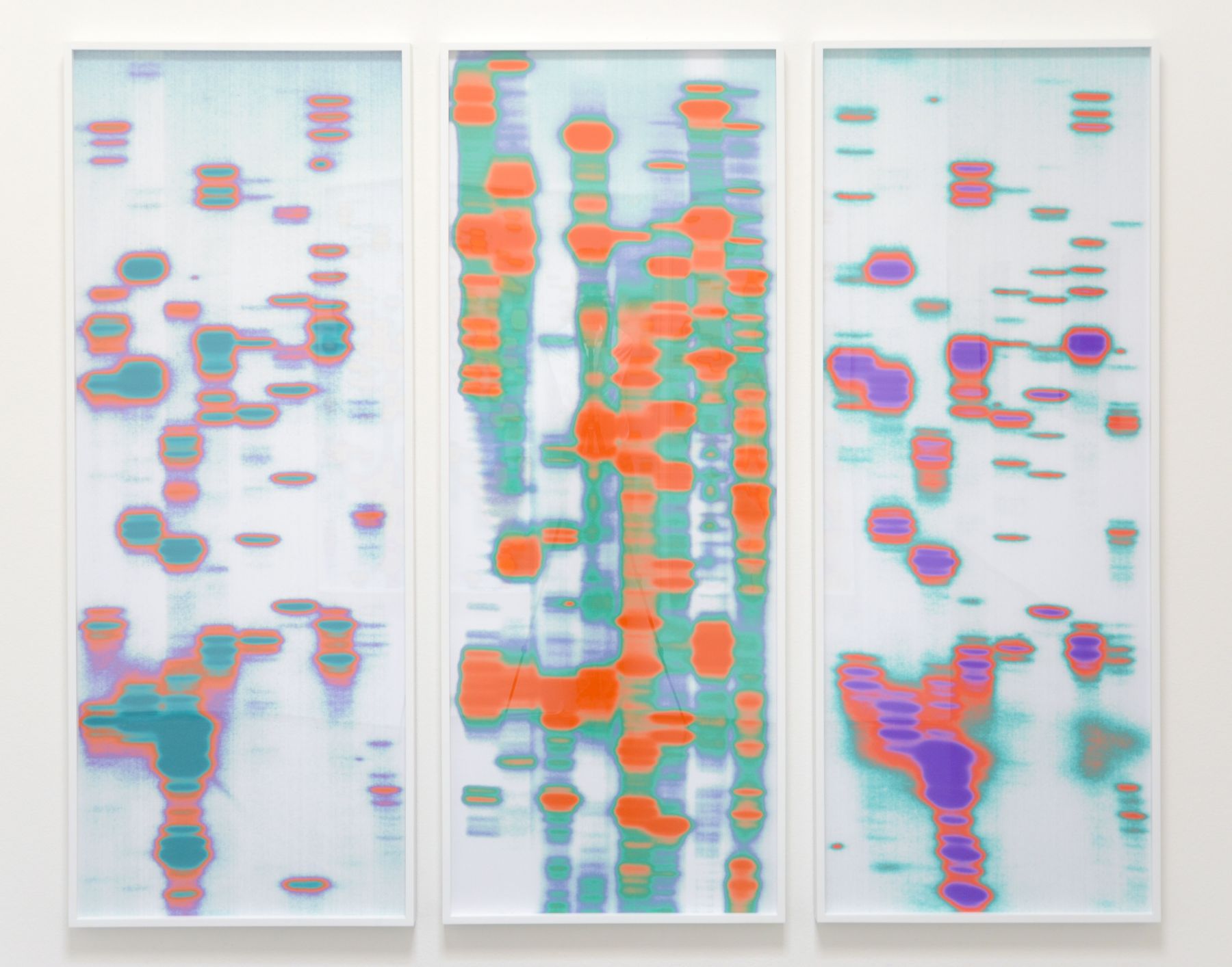
Byron, Lisa, and Emmitt (from The Garden of Delights), 1998/2016
archival pigment prints
triptych: 61 x 24 x 1-3/4 inches, each panel (framed), 155 x 61 x 4.5 cm; overall: 61 x 76 x 1-3/4 inches, 155 x 193 x 4.5 cm, 
edition of 3 with 2 AP

Infrared reference. Color inversions. Color-rendering with digital technology is always precarious in terms of perception and accuracy/authenticity. Given that these colors seem arbitrarily assigned to the process, it may not matter what result. Then again, it’s hard to imagine otherwise, a lack of intent that is. And if these works lack concern for color authenticity why go to such lengths to assign them? Meaning, if these works are more about the ideas, they could easily exist in grayscale or any color combination whatsoever. So, what do these triad of colors do in each triptych?


Iñigo Manglano-Ovalle, Christopher Grimes Gallery


Iñigo Manglano-Ovalle, Christopher Grimes Gallery

Lu, Jack and Carrie (from The Garden of Delights), 1998/2017
archival pigment prints
triptych: 60-1/2 x 23-1/2 x 1-3/4 inches, each panel (framed), 153.7 x 59.7 x 4.5 cm; overall: 60-1/2 x 74-1/2 x 1-3/4 inches, 153.7 x 189.2 x 4.5 cm, 
edition of 3, with 2 AP


Iñigo Manglano-Ovalle, Christopher Grimes Gallery

Jin, Calvin and Lisa (from The Garden of Delights), 1998/2017
archival pigment prints
triptych: 60-1/2 x 23-1/2 x 1-3/4 inches, each panel (framed), 153.7 x 59.7 x 4.5 cm; overall: 60-1/2 x 74-1/2 x 1-3/4 inches, 153.7 x 189.2 x 4.5 cm
edition of 3, with 2 AP

Triptych. I think often about DNA fingerprinting from my AP Bio class in high school. That has always stuck with me as a process and a form. So, it is with such enthusiasm that I view these works here, three triptychs, three different color schemes. Each migrated left to right color wise. Transmigration. The triptych is a loaded form art-historically speaking. The trinity. Here, vertical sections overlap in a watery light on water kind of way or possibly even Matrix-type scrolling. Organized like language but left open by lack of any recognizable symbols or other characters. They refer to people by each title, to Hieronymus Bosch, and to a lack of people ultimately. Color codes represent human identity.

Generative works that conceal identity visually yet reduce each being to its genetic code. We are just sequences and connections, configurations by virtue of creation, reproduction, multiplication and division.  Threes and fours abound.

They also somehow recall for me a kind of Mark Bradford. Whereas, Bradford was grinding layers to reveal accumulated history, a palpable material history, these seem to be doing the opposite, the reverse. 


Saturday, December 16, 2017

Phyllis Green "LIFE AFTER LIFE AFTER LIFE" @ Chimento Contemporary


Sky Shade, 2016
wood, canvas shade, fluorescent tubes
45 x 60 x 8 inches


Having seen an early body of Green's work, I was surprised by this particular piece.  I was also surprised with how much it resonated with something I had made and shown myself in 2012 (see here).  Assuming no relation other than happenstance, it occurred to me in viewing Green's version of a similar idea that while I was thinking about an architectural top line, a light valance, I just as easily could have been thinking about blinds.  I like the blind metaphor better. It fits better with the arc of my vision.  Whether shade or blind or valance, certainly how vision relates to architectural features is worth considering, especially if one is willing to allow human body and architectural body to  commingle, even if conceptually.  In this work, the window illusion seems obvious and fixed.


Tony DeLap "A Career Survey, 1963—2017" @ Parrasch Heijnen


Floating Lady II, 1970/2017
glass, wood and metal clamps
86 x 113 x 54 inches


Drawing for Psychic Sympathy, 1980
acrylic, graphite and colored pencil on paper
11 1/2 x 14 1/2 inches


Dedi of Desnefru, 1976
acrylic on canvas and wood
89 x 73 1/2 x 3 1/2


Jim Beam, 2017
acrylic on linen over aluminum
13 x 13 inches


Easy Aces, 1982
acrylic on canvas
64 x 95 x 4 1/8 inches


Zignette, 1997
acrylic on canvas and wood
39 x 25 1/2 x 3 inches


Ionia, 2007
acrylic on canvas
21 x 21 x 2 1/2 inches


Floating Lady II is complicated at best.  Curiously situated at the threshold of two adjoining spaces, it was afforded no discrete views nor did it afford discrete views of certain other works.  Not quite an elephant in a room and not unlike such things, it is a conundrum to be sure, torn between spaces, identities, and even time periods given it's duality in such matters. Thirty seven years separated its public reception.

As such with said observations, it seems almost textbook to what I began thinking about years ago as interdimensional objects, objects that occupy a liminal space physically as well as psychologically largely dependent on point of view and therefore dependent on a physical audience in real space let's call it, and also literally occupying an intermediate dimension between, for example, two or three, and possibly more. Further, as glass will always do, it also invites a virtual space by lighting condition, reflection, and again, viewer position or rather focal length. So, real and virtual space subsume mind and body relations in an elusive and unresolvable condition, one that embraces the dynamic despite being literally static, tenuous and precarious position to be sure.  Had Floating Lady II been viewable in a completely isolated space, it would still have had the aforementioned complications but not without interference from other works in the show. I was assured by the gallery that this installation was typical and therefore in my opinion brave in its clutter to what could have been an otherwise more clarified and sublime viewing.

Speaking of such clutter, the wall objects in the show could also be dubbed interdimensional objects, though they were not in any way cluttered on their own terms. Carefully formed and painted, these objects displayed spatial transitions between dimensions, between architectural space and object and between viewer and relative positions.  So, the peripatetic experience was in full effect with these artworks, restless all in their reconciliation (or not) of both linear and nonlinear space. 

It's also worth noting that these works could not function nearly as well without the default white walls of the gallery.  Certainly, the works that incorporated white in and of themselves would have been seen very differently against a green wall, for example Ionia, and certainly red if one wanted to go high contrast with the same one.

Despite a certain lack of clarity in the overall viewing experience, it was worth relating the relatively temporary objects with the relatively permanent ones. For both types made for a dynamic and puzzling viewing experience, one that reminds us of just how much the reception of art is largely dependent on a certain kind of viewing context, one that ultimately can not be controlled.