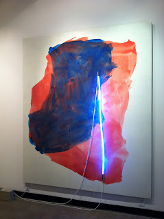
When I think of Bakersfield, I imagine rural landscape (read: sparsely agricultural, dusty western town), Buck Owens, and Korn (That’s corn with a K and a backwards R. For the uninitiated, it’s a multi-platinum selling heavy metal group incorporating tropes of hip-hop and rap into their mix). My own random associations aside, I now add to the list a city with unexpected and fun-to-wonder-about street names like “Real”, “Truxton,” and “Eye.” It was in just such a context that a handful of combine paintings (flashe and neon light on coarse linen), “The Bakersfield Project” by Mary Weatherford were displayed at the Todd Madigan Gallery, Cal State Bakersfield. Seven paintings (all measuring 93” x 79”) were installed symmetrically on four walls save an odd one installed in the “outside” hallway.
With two entrances at either end (south or north), the first painting encountered, said outsider---“California”---a roundish field of washy blue and orange pushed toward neutral without resolving into mud. Frankenthaler’s “Adriatic” comes to mind (see my post from March 23 here) though Weatherford maintains within the frame of each painting throughout the show; each painting’s color field flirts with the white edges but rarely, if ever is close enough to breach. Conversely, the neon application and the light condition more generally was another matter entirely. Really the thrust of the show in terms of a through line (pun intended), lengths of ropy, neon light in a range of hues was obliquely attached to the surface of each canvas as various positions were attempted from linen to linen, though all noticeably toward the vertical.
Willing to go along for the ride, passages of the deftly handled, washy flashe, were smudged over the surface of each toothy linen in various restrained gestures, clear enough to appreciate the record of application, to follow its own history. Externally, Rothko, Newman, and Guston also came to mind, as did Courbet as well as more remote places—caves--pushing toward a great beyond. Overall, a rocky, multifaceted approach could not be ignored.
Aside from the wonderful play of pictorial references, the neon appendages were a greater puzzle, though understandably so given Weatherford’s first exploration with them. As such, each painting was a grope between color and light where I couldn’t decide how much I was supposed to care about which one or the mix for that matter. On the plus side, each illuminated line hung elegantly toward the nearest outlet. In some instances, it was a nice sweep toward the next painting, at others a quandary and a distraction. Also worth mentioning is that each painting was also illuminated from the gallery track systems overhead more generally. As the gallery attendant was kind enough to oblige turning the tracks off for an alternate view, as I suspected, the paintings became richer and more complex in the darker setting as materials commingled with greater attention placed on what Weatherford might be suggesting about how place is qualified and defined through as a sense of changing light and material conditions. As the press release stated, each painting is meant to evoke a certain location in and around Bakersfield, and they were titled as such.
Upon leaving the gallery, I learned certain details from the attendant, notes that I wish were more readily available in the work or perhaps didactically somewhere else in the show, or at the very least glanced in the press release. For example, to know that Weatherford scavenged materials for the red neon (a now nonexistent gas), perhaps a fine adieu to the Newman homage which displays it; that “North Chester Avenue” contained uranium hence the queer yellowy/green radiating quality; and that “Midnight Union Avenue” evokes a bustling red-light district (albeit Weatherford’s choice for orange); all outside details enriched the work in a way that concept often fails paintings that rely wonderfully on formalist tendencies (as if it were possible to do otherwise!). Had I known that each neon was meant to also suggest language and sign (again pun intended) as matter of facts (and not just the manufacturer’s cord stamping), I’m just now feeling a bit silly for not having caught the available word play sooner. On the other hand, I was willing to plumb the depths of proposed voids where language is blurby at best, where dense, flat passages of paint consume light or conversely where lightness is felt in the paint handling, itself delicately teasing the edges.
While given to wonder about the quality of each site and to enjoy interludes of paint and light, unless we are privy to the specific locale, as a Bakersfield resident might be, there is no information in the visual field to contextualize the places concretely. Of course, said poetic ambiguity is not without its charms. In hindsight, I suppose I wouldn’t have even cringed at the sight (site) of a rocking, backwards “R,” though arguably, it would have been a bit Korny.


No comments:
Post a Comment